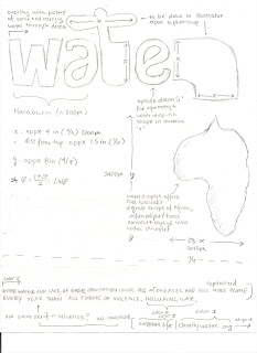
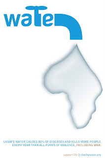
 You've probably noticed by now I have a thing for minimalism and Harabara. I got inspired by the Good 50x70 project, with special attention to their gallery for water scarcity. The sketch started with a really badly drawn Africa, but you get the idea. And the proportions are completely off, but you can see for yourself. The "water" was created in Illustrator and then cross platformed to PS. I did some Ctrl+Ting for adjustments, though. Anyway, I originally wanted to just do a solid color "water" but then I realized I needed MOAR PHOTOSHOP, so I pulled a giant picture of a drought in Senegal and did that text overlay thing we did in the beginning of the water.
Next came the Africa shape. Illustrator's Live Trace was immensely useful and resulted, with the right parameters, a shape that walked the line between vague and exact. I knew that if the shape was exactly like the map, realism would like 0, so I loosened up blur and played around with it. Afterwards though, came the hardest part - making the drop seem like a drop. I scoured designbump and the internet for some tutorials, but the majority of them relied on have a background (i.e. a leaf). Since I planned for a stark white and I didn't plan to deviate, I had to look at a few and stitch together some sort of Franken-tutorial. The main information I used came from Lunacore, though. At one point, I stumbled upon a tutorial for Adobe Fireworks, but I couldn't quite adapt it to the abstract Africa shape. All of them made heavy use of blending modes, so I took it as a cue and took the paramaters given and played with it from there. I adapted the tutorials to the immense size of the shape and the fact that it didn't have a background to rely on. To add some more realism, I ended up adding a black to white gradient and adjusted opacity. I also went over it a few times with a soft round brush to add hints of depth here and there. Lastly, to give it a sort of blue color, I added another layer, took a giant brush and went over it, and set the layer to overlay and toned down the opacity.
Below is a simpler version of the final product, instead of drought text, it has clean lines and solid color.

Credits
[1][2][3][4][5][6][7][8][9][10][11]


0 comments:
Post a Comment