Pages

Monday, June 6, 2011

Alphabet Soup


So it's true.  I love typography, so this project's content, and the high point value, convinced me to do it, unnecessary comma.  So here it is.  The result of days of scouring the internets for tutorials and fonts and brushes and textures.  


[a] [b] [c] [d] [e] [f] [g] [h] [i] [j] [k] [l] [m] [n] [o] [p] [q] [r] [s] [t] [u] [v] [w] [x] [y] [z]

Tuesday, May 3, 2011

So These Jpegs Walk Into a Bar...


As you may recall, my wrap text is functionally retarded.  It seems like it also applies to images.


Countless gradient maps, adjustment layers, pen tool points, magic wands, extracts, soft brush, erasers, vector masks, clone tools, history brushes (and all the things in between) later...


This project was pretty challenging.  At first, I was pretty shaky on the concept.  I wanted something based off of Antonie Saint-Exupery's The Little Prince, but there weren't any tutorials that could help me and n its conceptual/early constructional stages it was pretty shaky and lackluster.  After that idea, it progressed to a Jules Vernesque fantastical underwater scene, but researching underwater tutorials yielded nothing that vaguely resembled or even could vaguely resembled something from Twenty Thousand Leagues Under the Sea.  So I changed my idea to something more surreal and fantastical.  The tutorial it's based off was discussed in the previous post.  I knew I wanted a floating island of some sort, something reminiscent of Miyazaki's Castle in the Sky (reference here) -- a baobab tree to homage Exupery, out of a dilapidated castle floating with a tangle of roots.  The problem came with execution.  I couldn't find any large images of the roots of trees, and I didn't want to use a silhouette.  The perspective was off, while I did find the perfect castle component with an artist's rendition of the Tower of Babel.  I was a bit too ambitious in the beginning, and the design has changed a lot since then.  Originally, the castle-tree-island was supposed to be the focus in a free floating sky, but the lack of shadows subsequently gave it a serious lack of depth.  I thought other elements that I had planned (such as a fish shaped hot air balloon with a strawberry carrier) would make up for it, but the composite sky canvas (stitched and clone tools together from several images) remained recalcitrantly mundane.  Instead, I decided to place the surrealism to a place perhaps a bit more down to earth  I researched Moorish architecture.  I really wanted to use Alhambra, but couldn't find any suitable images so I settled on a simple Gothic cathedral. During the process, the pen tool was arguably my best friend and worst enemy - Extract marred the image, but pen tool assuredly gave me carpal tunnel.  From there, it was a matter of clone tooling.  The mess of roots that was to be never came to fruition - instead I took the turtle idea from the tutorial and shopped the roots to wrap around the turtle's shell.  The most difficult aspect of this project was perspective.  The cathedral was taken at an unique angle that was difficult to emulate even with extreme use of warp and perspective in free transform.  As a result, the end product is admittedly somewhat fractured.  The origami cranes proved to be a whimsical component, and the sea life added carried through one of my initial ideas of a fantastical underwater scene.  The hot air ballon got replaced by a blimp and clone tool came into play once again to give the background composition some depth.  The adjustment layers unified the colors significantly -- before, the look was a bit off because of all the different images in different lighting and setting. 

Overall,it was a rewarding project and the end result is something I'm satisfied with.

Tuesday, April 26, 2011

Turtle Tutorial


Countless adjustment layers, pen tool points, ctrl+t's, clone tools, history brush, gradient maps, photo filters, brush tools later...

[Tutorial]

Monday, March 28, 2011

Water for Africa

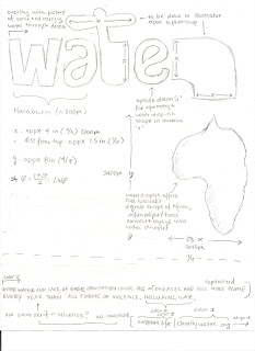
You've probably noticed by now I have a thing for minimalism and Harabara.  I got inspired by the Good 50x70 project, with special attention to their gallery for water scarcity.  The sketch started with a really badly drawn Africa, but you get the idea.  And the proportions are completely off, but you can see for yourself.  The "water" was created in Illustrator and then cross platformed to PS.  I did some Ctrl+Ting for adjustments, though.  Anyway, I originally wanted to just do a solid color "water" but then I realized I needed MOAR PHOTOSHOP, so I pulled a giant picture of a drought in Senegal and did that text overlay thing we did in the beginning of the water.

Next came the Africa shape.  Illustrator's Live Trace was immensely useful and resulted, with the right parameters, a shape that walked the line between vague and exact.  I knew that if the shape was exactly like the map, realism would like 0, so I loosened up blur and played around with it.  Afterwards though, came the hardest part - making the drop seem like a drop.  I scoured designbump and the internet for some tutorials, but the majority of them relied on have a background (i.e. a leaf).  Since I planned for a stark white and I didn't plan to deviate, I had to look at a few and stitch together some sort of Franken-tutorial.  The main information I used came from Lunacore, though.  At one point, I stumbled upon a tutorial for Adobe Fireworks, but I couldn't quite adapt it to the abstract Africa shape.   All of them made heavy use of blending modes, so I took it as a cue and took the paramaters given and played with it from there.  I adapted the tutorials to the immense size of the shape and the fact that it didn't have a background to rely on.  To add some more realism, I ended up adding a black to white gradient and adjusted opacity.  I also went over it a few times with a soft round brush to add hints of depth here and there.  Lastly, to give it a sort of blue color, I added another layer, took a giant brush and went over it, and set the layer to overlay and toned down the opacity.

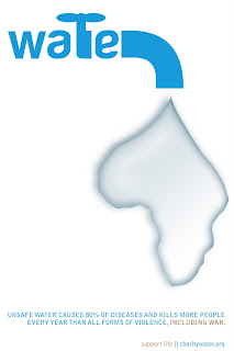
Below is a simpler version of the final product, instead of drought text, it has clean lines and solid color.

Credits
[1][2][3][4][5][6][7][8][9][10][11]

Wednesday, March 2, 2011

Color Theory Presentation

This version is Blogger-approved, but laggy like no other.  Try using the mirror and hit fullscreen.


Mirror:


Behold the power of Adobe Flash. This one is more high res and you can click through it at your own pace.


Some Terminology:


COLOR: general term for the qualities of hue, intensity, and value observed in pigment or light.
HUE: the name of a color, such as red, blue, green....

range of color
CHROMA: intensity, strength, or saturation of color, distinguishing the chromatic colors from black and white.
SATURATION: degree of vividness of a hue from its concentration; used synonymously with chroma.
More Saturation---------Less Saturation 
saturation
VALUE: range from light to dark, including white, grays, and black; colors can be evaluated on this scale. Values are often numbered on scales of 0 to 10. In one system 0 - black and 10 - white; another system reverses the designations and has 0 for white and 10 for black. Generally, high values are considered to be light, and low values dark.
value
COLOR WHEEL: divided or sectioned circle with colors in a spectrum effect.
COLOR TRIAD: three colors spaced an equal distance apart on the color wheel, such as red, yellow & blue or orange, green & purple.
COMPLEMENTARY COLORS: colors directly opposite each other on the color wheel such as blue & orange, red & green, yellow & purple.
SPLIT COMPLEMENT COLORS: use of the colors on each side of a complementary color.
PRIMARY COLORS: (artists) red, yellow, blue (printing inks) magenta, cyan, yellow
SECONDARY COLORS: orange, green and purple, made from mixing the primaries: red and yellow make orange, blue and yellow make green, and red and blue make purple.
TETRADS: color harmonies based on four colors; using every fourth color; the tetrads on the Prang color wheel; yellow-orange, red, blue-purple, and green; orange, red-purple, blue, and yellow-green; red-orange, purple, blue-green, and yellow.
TERTIARY COLORS: in contemporary usage, the intermediate colors are considered tertiaries: yellow-orange, red-orange, red-purple, blue-purple, blue-green, and yellow-green; in early color theory, the mixture of the secondary colors created a tertiary, as green mixed with orange, orange mixed with purple, and purple mixed with green


 Direct link here.


Sources used: [1] [2] [3] [4] [5]


Resources Used: [Prezi] [Screencast-o-Matic] [Jaycut]  Props to free, web based applications.